
National
Tulip Festival

The National Tulip Festival is a celebration dedicated to celebrating the long-lasting friendship between Canada and the Netherlands. Every May the festival takes place in Ottawa as the tulips bloom. This project focused on completing a rebrand for the festival and developing a marketing campaign to help spread awareness about the festivals’ history and purpose.
Scope
Created as a self-directed undergrad project during
the fourth year of the Bachelor of Design program.
Year
2024
Design Challenge
The National Tulip Festival has been happening for over 70 years yet not all attendees know about the origins and history of the festival. The current branding is generic and does not touch on any of the deeper themes of the festival.

The Answer?
A marketing campaign positioning the event as a “Festival of Friendship” to share it’s origins while building new meaning.
The Orginal Logo
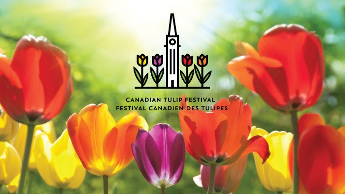
While the original logo effectively communicates the festival’s subject matter, the event lacks a strong, cohesive visual identity across its various touchpoints. The existing design relies on literal imagery, featuring tulips and a depiction of Parliament Hill to signify the festival’s location in Ottawa. The goal of the redesign was to create a distinctive and flexible visual system that could be applied consistently across a wide range of materials while incorporating historical elements that celebrate the festival’s rich heritage.
Retro
Inspiration
Using bright colours, bold retro-inspired graphics, and rich textures, the visual identity embraces a maximalist and eye-catching aesthetic. The colour palette draws inspiration from the vibrant hues of tulips (reds, pinks, and yellow) paired with light teal, dark navy, and black to ensure strong contrast and readability.


A Festival
of Friendship
The National Tulip Festival traces its roots to the 1940s, when Canada sheltered the future Dutch queen and her family during WWII. In gratitude, the Netherlands gifted Canada 100,000 tulips and continues to send 10,000 bulbs annually. Inspired by this enduring friendship, the campaign embraces the tagline “A Festival of Friendship.” The visual identity combines retro-inspired, textured illustrations with vibrant tulip-inspired colours, balanced by navy and teal. Quirky illustrations, checkered patterns, and circular motifs create a nostalgic yet cheerful aesthetic.
Guiding
the Way
Since the festival largely takes place outdoors, unique signage was created to help guide attendees from event to event. Quirky tulip shaped signs and signposts were created, alongside posters and standing banners. Keeping in mind the history of the festival, standing banners help share knowledge in a digestible and fun way. Printable such as an event booklet and a tulip guide help to inform attendees about the event and fun facts about tulips in general, such as what the different colours of tulip represent.

Extending the Experience
What do you do when you have a collection of quirky illustrations? Why you make merch! Turning attendees into walking billboards, the created merch includes items for both youth and adults. Items such as lanyards, sweatshirts, tote bags, water bottles and yo-yo’s help attendees walk away with a moment from the festival while also providing further advertising for the event.

