Simplee
Toothpaste
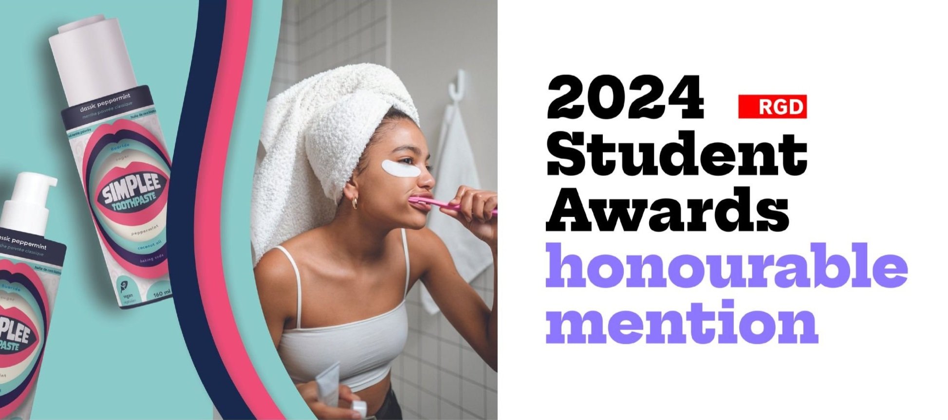
The main goal with Simplee Toothpaste was to create a toothpaste brand that breaks the mint-flavoured industry mold. Inspired by how beauty products are packaged and displayed, Simplee is a low ingredient toothpaste that uses bold colours and shapes to stand out against other toothpaste brands.
Client
Created as an self-directed undergrad project where the brief asked designers to create build a brand concept including branding, production logistics and deliverables.
Year
2024
Design Challenge
The oral care category hasn’t seen innovation, growth or a massive shift in the last few years unlike the skincare and beauty sectors. How could toothpaste be elevated from the current boring basic into a new wellness experience that stands out amongst competitors?

The Answer? A toothpaste brand that puts a focus on being innovative in formula, packaging and branding to stand out on shelves.
White, Red and Blue Reimagined
Is it possible to reimagine the iconic red, white and blue colour scheme of toothpaste while not losing the association? The answer is yes. Mixing magenta, eggplant, eggshell and teal allows for a refreshed take on the classic colour scheme that remains modern and hip to appeal to a younger audience.


Low Ingredient, HighImpact
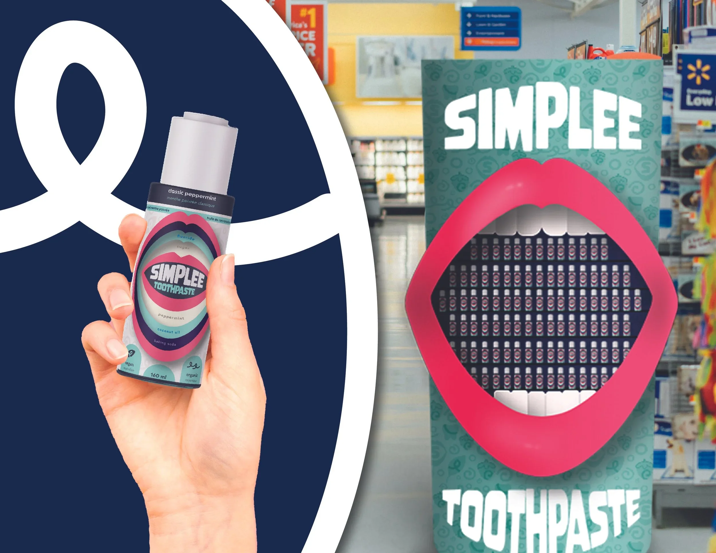
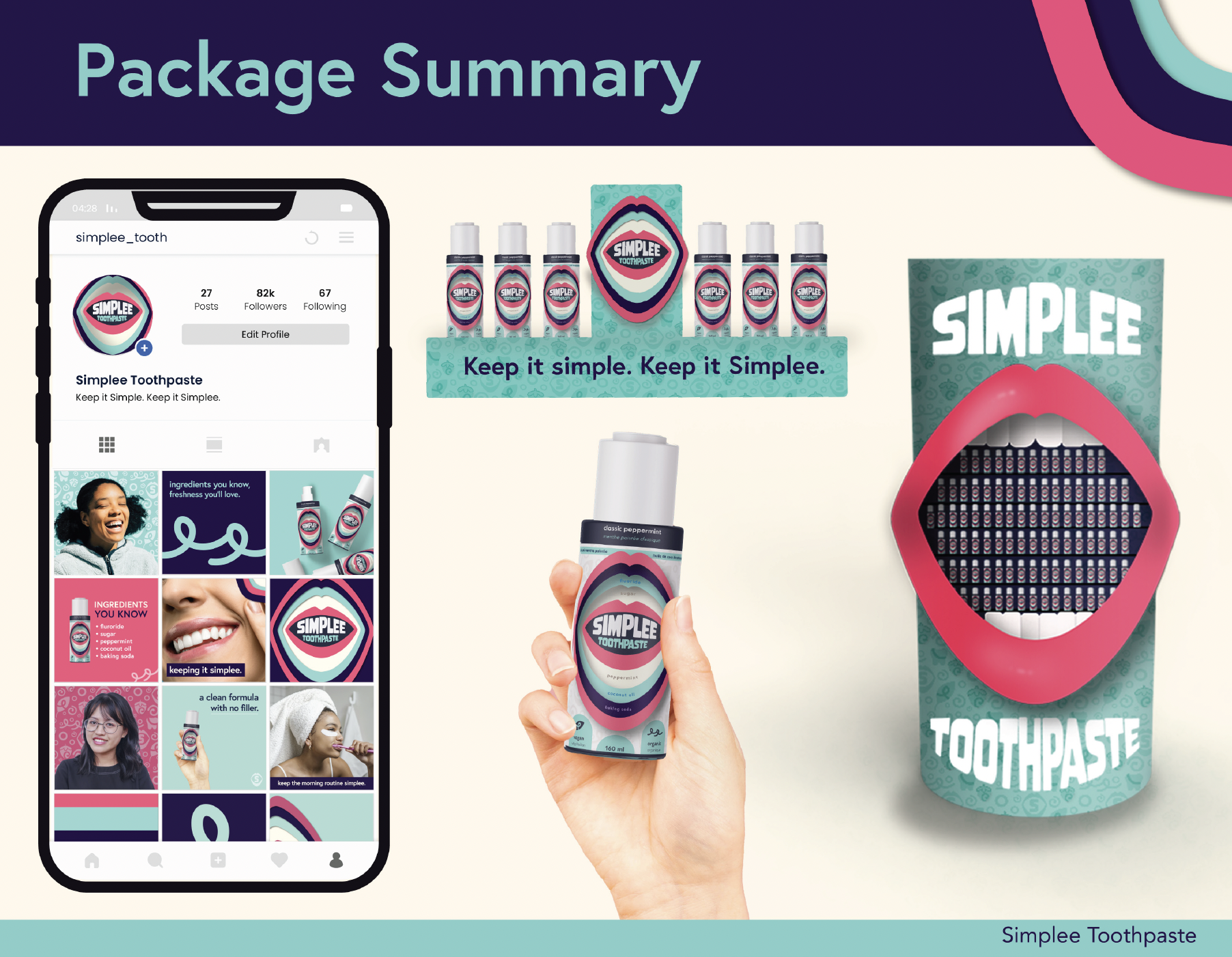
Following health trends, simply boasts a simple and low ingredient formula that still gets the job done. The packaging design boldly lists its entire ingredient list on the front of the pack alongside icons showcasing its status as vegan and organic.

Creating A
Mess Free Bottle
Taking inspiration from beauty and skincare, the horizontal bottle is designed to stand out from traditional toothpaste tubes. Featuring a message free pump, the sleek design helps customers get the perfect amount of product out without the hassle and mess. Gone are the days of rolling, stretching and cutting toothpaste tubes to get all of the product out.
Taking It Vertical
Looking at a the toothpaste aisle, all of the displays and boxes feature horizontal specs. By going against the standard, simplee’s bottle is box free and stands tall on shelves amongst a sea of monotonous packaging. Getting rid of the cumbersome outer box typical in toothpaste further helps the product to stand out on shelves.